FreshBrand - Tư vấn thương hiệu, nhận diện thương hiệu, tư vấn tái định vị thương hiệu, tư vấn chiến lược marketing, thiết kế logo, thiết kế bao bì.


Wouldn’t it be nice if brands came with owner’s manuals? It’s not actually too much to ask. By documenting the decisions made during the development of a graphic identity and its initial applications, designers can help ensure program consistency moving forward, even as other brand managers and creative partners assume responsibility for care and feeding of the brand.
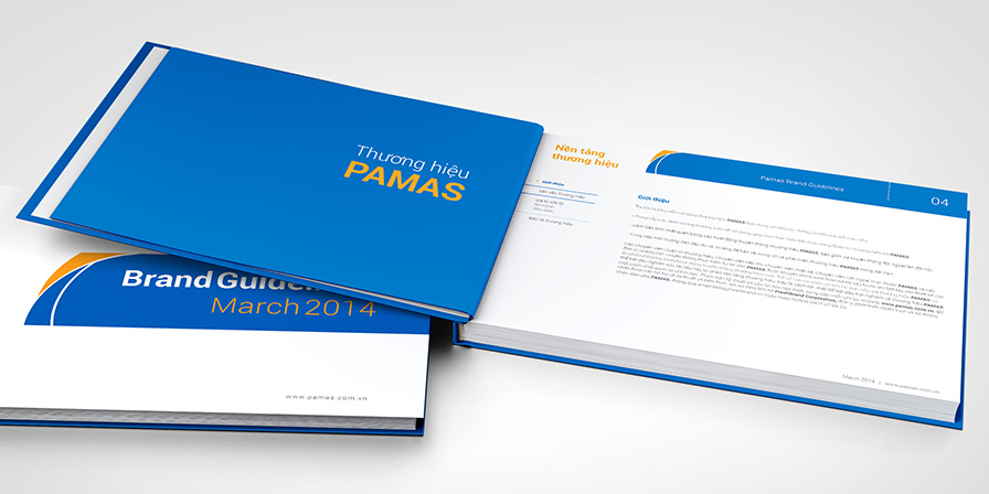
LOGO SPECS
Once you’ve arrived at a perfect drawing or configuration for your graphic identity, take the time to write it down. Documenting the origin and development of a graphic identity challenges designers to work out what’s been going on in their heads. Quite often, this process also leads to refinements that improve the mark.
Articulating these ideas amounts to more than self-exploration. Documenting a graphic identity this way also allows you to share a record of your decision-making process and the wisdom behind it. This record can build in room for variation while protecting against compromising the integrity of the mark. It establishes rules, guidelines, dos, and don’ts.
It isn’t any arrow; it is this arrow. It isn’t any serif typeface; it is Bodoni. Anything less adds up to something that is not this graphic identity.
![]()
A thorough set of logo specs should cover the precise drawing of a logo, the position of elements, spacing, color, and proximity to other elements. Attention to detail here can add to an overall sense of quality and craft, and set a tone for the overall program.
APPLICATION RULES
Large firms work with many business and creative partners as well as vendors and suppliers who make decisions on a daily basis about how a mark is applied and they probably shouldn’t. Nonetheless, if identity specs are written clearly and designed well, and if they are presented positively and enthusiastically, most partners will see them as a burden lifted rather than a new one added.
Identity program specs might address scale, position, color, proximity, and number:
Scale How large or small is the mark relative to the overall size of a sign, etc.?
Position What is the mark’s position relative to other elements? How close can it be to the edge of a business card? How must it align with other things?
Color Is the mark always the same color on the same background color?
Proximity What other typographic or visual elements accompany the mark?
Number How many marks appear on the side of a building? Forty or one?
Program specs should define the rules, but with enough latitude for experimentation.
![]()
Careful documentation of program rules and guidelines serves as a record of decisions made, helping to police consistency and quality.
BRAND BIBLES
Brand guidelines contain the dos and don’ts of a brand. Brand bibles capture its spirit and promise.
Brand bibles trace their roots back to the elaborate annual reports companies began producing in the 1970s. At that time, well-known designers helped companies seize an opportunity presented by their SEC-mandated annual financial reports. If done well, these documents could communicate something to stockholders beyond earnings. Designers re-created the front-door experience for investors, seeking buy-in through corporate cheerleading.
Years later, as companies moved their financials online, a new generation of designers encouraged companies to continue publishing the promotional part of their annual reports for internal use.
The brand bible was born. Since companies no longer refresh their brands in annually produced reports, these brand bibles became more precious.

These brand bibles enlist bold claims and metaphorical imagery to move primarily internal audiences to realize the potential of their brands.